The Military Entrance Processing Command (MEPCOM) is the U.S. government entity responsible for assessing military applicants during the enlistment process. MEPCOM uses MEP station facilities to ensures that applicants meet the Department of Defense (DoD) standards for military service.
The Challenge
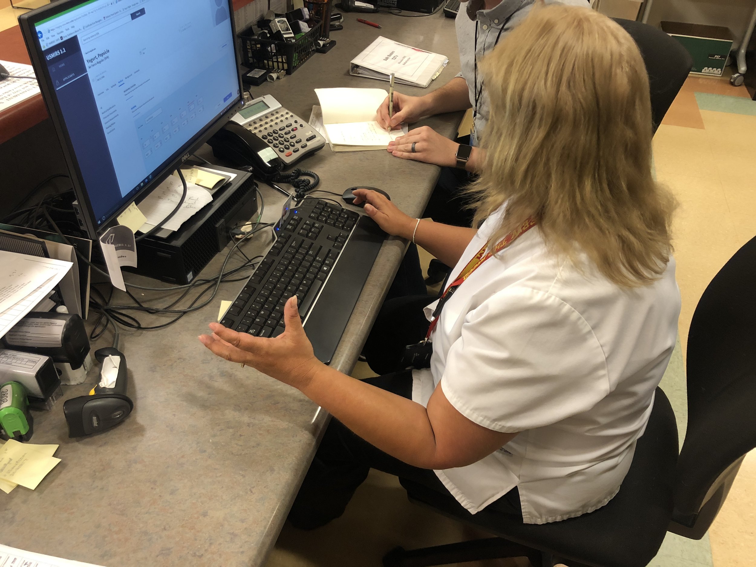
Bring MIRS, the software used during an applicant’s enlistment process, into the 21st century. The original tool was built in the 1990’s and has not been updated since. During user research we discovered how time consuming and difficult the tool made a user’s job.


How might we help MEP's employees process applicant information accurately and efficiently?
The Solution
A web-based desktop application designed to reduce errors in data entry and enhance scannability, allowing users to quickly assess the current status of an applicant.


Research
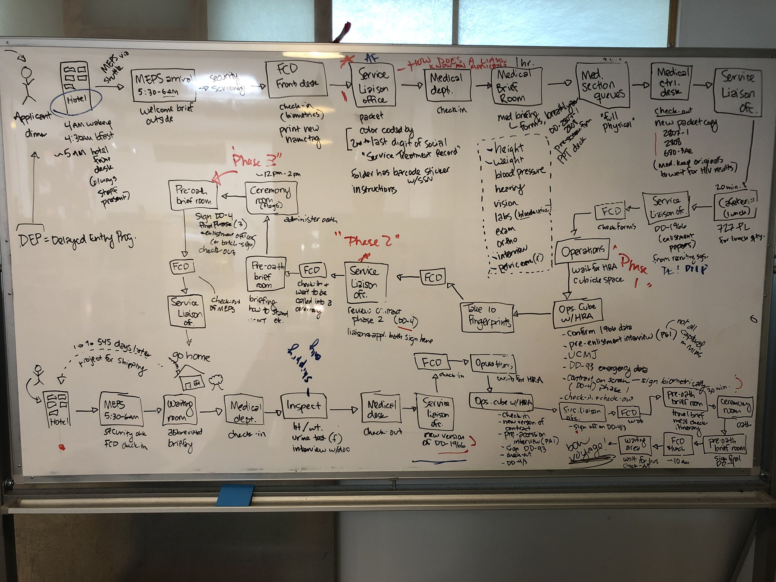
Extensive research was conducted to understand the complex process of assessing civilians for military service. There was a focus on the applicant’s packet—a paper trail carried throughout the enlistment process. This packet was handed off to MEPS employees at each step, with data entered and reviewed multiple times.
By creating user journey maps related to the packet and applicants, we defined user roles and permissions for the new tool. We also conducted timed task tests to assess applicant status, schedule activities, and data entry.
Findings
The original tool had very limited error handling which allowed users to enter and submit invalid data.
Unique applicant cases impacted qualification status, leading to potential delays if tasks to resolve the qualification status weren't completed in the correct order.
How the findings were addressed
Forms were carefully constructed to mitigate risk for errors. This required error handling and validation rules being surfaced at the right time with clear guidance on how to resolve the issue.
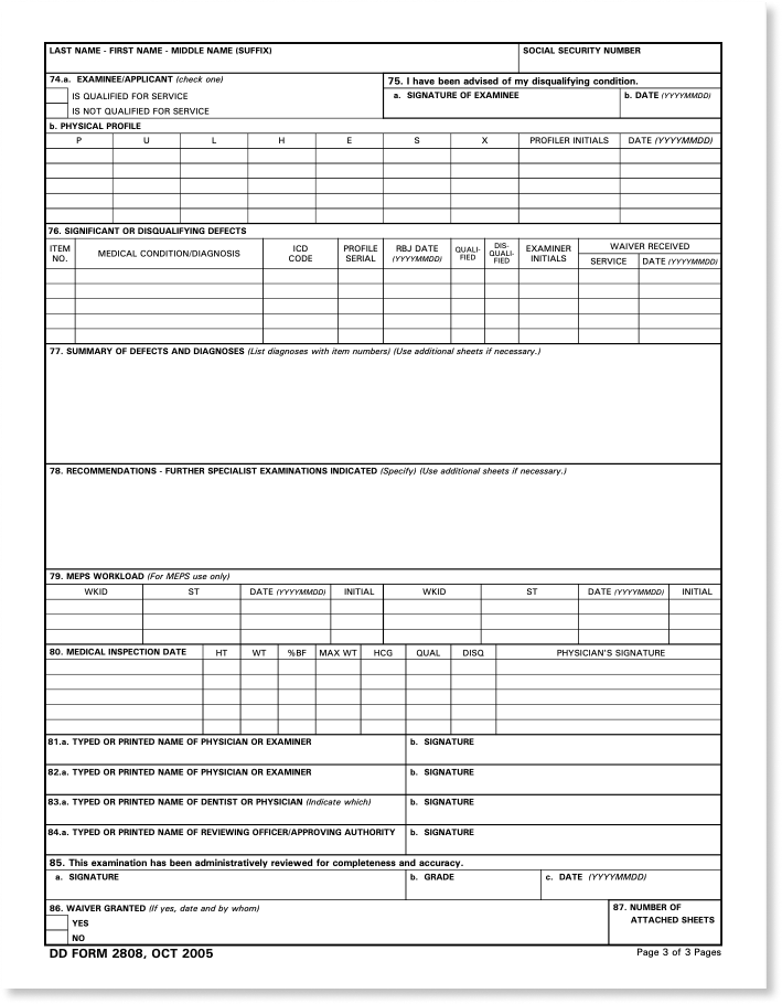
Medical evaluations are the most impactful on an applicants qualification status. The requirements to resolve these disqualifying factors can be messy. The medical section was carefully designed to communicate where in the process an applicant was and to easily determine if the applicant was ready for the next step.
-

Click 'yes' or 'yes'
Users were accustom to confusing error messaging and using their notes to sift through data to determine next steps for an applicant.
-

Nothing is straight forward
An applicant may be flagged to receive a consult. In order to resolve this flag, the applicant may need to work with up to 5 folks in different departments to schedule an appointment.
-

Button mash to access this menu
The 340 page manual for the original software described each key stroke combination used to access ipnuts and specified values.
Usability Testing
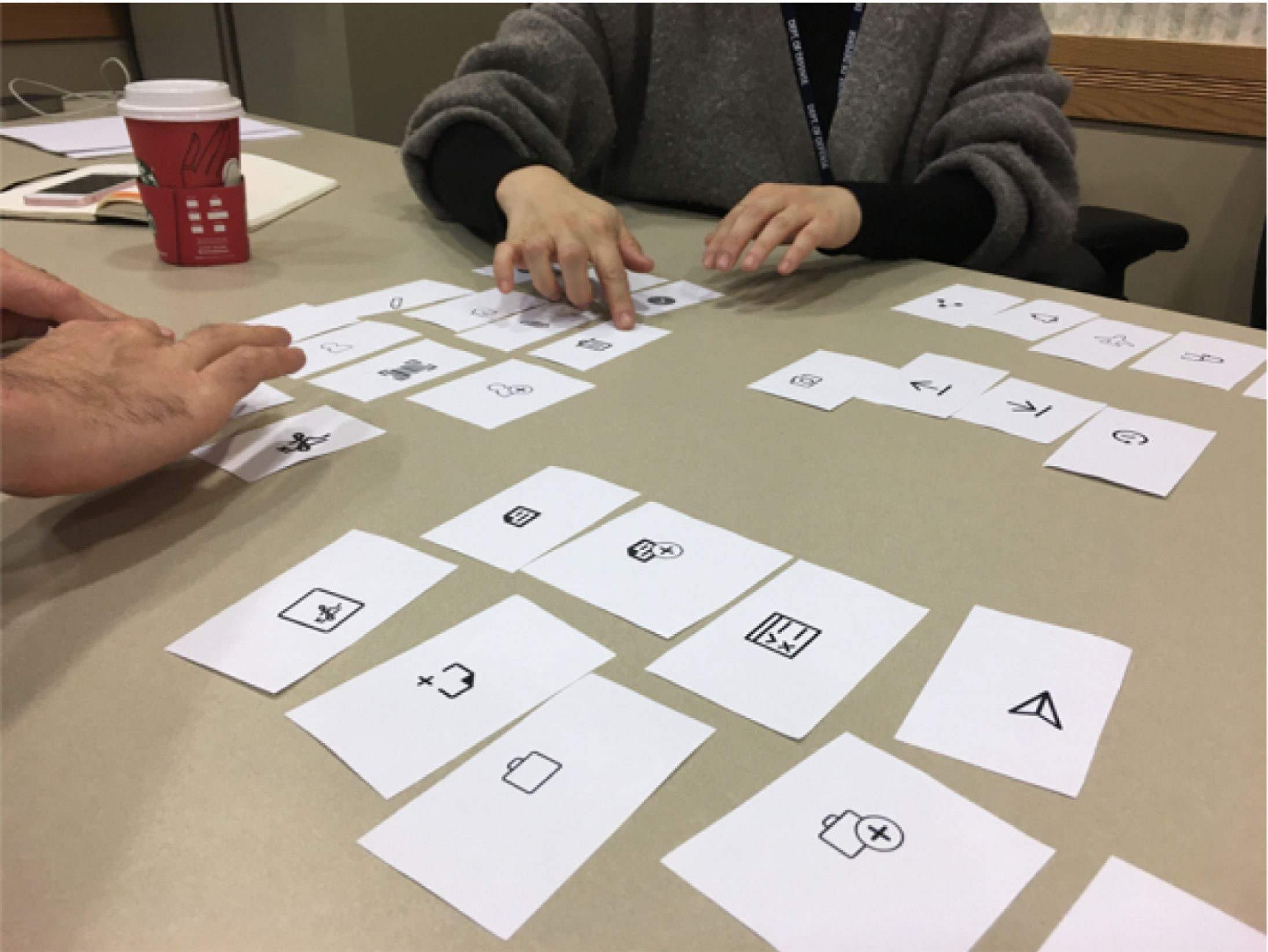
During our research, we noticed users relying on sticky notes and laminated cheat sheets for various codes and shortcuts. The original software could only be navigated using the tab key and sometimes required specific key combinations to bring up certain menus. Users couldn’t use a mouse to navigate the application and they were used to that. This came back to haunt us during user testing with clickable prototypes.
We also faced connectivity issues, as users couldn’t access prototypes on their work computers, and internet connectivity for our laptops was often unreliable. After several iterations, we addressed these issues by using wireless hotspots and, when necessary, used paper prototypes to simulate different navigation structures and layouts.
TAB ORDER MATTERS
The order users scanned documents to enter data was not linear. Disruption to their flow affected their attitude toward the software. They felt like they were wasting time clicking around the tool to fill out a form when they knew what data was essential to moving the applicant forward. Non-essential data could be returned to at a later date or would be entered by the ops team that audits the paperwork.


CASH PAPER IS KING
Our personas revealed that users were experts in their roles but generally uncomfortable with digital tools. High-fidelity digital prototypes elicited more technical than subject-based feedback.
Recognizing this early allowed us to optimize a navigation structure and iconography system that aligned with users mental models.

Iterations
Since this would be MEPs employee’s first impression, the details had to be right. Iconography, language, and layout were fine tuned during the entire process.
-

Initially users “wanted to see everything.”
-

Through user testing, we discovered they actually needed high level statuses, not finite details.
-

Users were uncomfortable with big visual changes. We referenced back to the paperwork used to complete this section as the bones for the final layout.
Conclusion & Impact
Since the software’s original release in the 1990s, there have been several changes to the requirements in the enlistment process. Users had to create their own notations and workarounds to fit within the new standards and had no way to update the tool.
The outcome of this initial phase laid the groundwork for the USMIRS system, which is now in use at MEPs stations across the country. The web-based application can be updated as needed per regulations and has decreased the data burden on MEPs employees.
Reflection
Developing a strong relationship with the users and the client was crucial. Unsurprisingly, the US government is a behemoth of a client due to extensive requirements, policies, and decades long processes in place. Gaining user trust and support was essential for creating a tool that met their needs while managing their expectations.
Unlike most of my projects I’ve designed for clients, I was able to experience as a user during my enlistment process. It was disarming to the staff when I asked them about the software they were using, but my interest was made clear when I told them about my involvement with MIRS. It was rewarding to hear about the impact the software has made on the users’ daily tasks and humbling to hear about the shortcomings that were yet to be resolved.
What I would do differently
I would spend time refining the error messing. We spent time making sure the language aligned to the users current mental model for steps to resolve an issue, but given the long term relationship with the client and users, I believe by investing more in developing user-friendly language we could have reduced the knowledge ramp up needed to onboard new users.